标签:条形 bar Python 全网 chart df race ax size
这个动图叫条形竞赛图,非常适合制作随时间变动的数据。
我已经用streamlit+bar_chart_race实现了,然后白嫖了heroku的服务器,大家通过下面的网址上传csv格式的表格就可以轻松制作条形竞赛图,生成的视频可以保存本地。
https://bar-chart-race-app.herokuapp.com/
本文我将实现过程介绍一下,白嫖服务器+部署留在下期再讲。
纯matplotlib实现
注:以下所有实现方式都需要提前安装ffmpeg,安装方式我之前在决策树可视化一文中有介绍
matplotlib实现bar-chart-race很简单,直接上代码
import pandas as pd
import matplotlib.pyplot as plt
import matplotlib.ticker as ticker
import matplotlib.animation as animation
from IPython.display import HTML
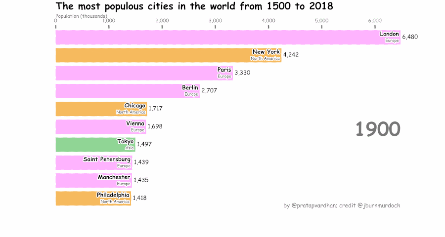
url = 'https://gist.githubusercontent.com/johnburnmurdoch/4199dbe55095c3e13de8d5b2e5e5307a/raw/fa018b25c24b7b5f47fd0568937ff6c04e384786/city_populations'
df = pd.read_csv(url, usecols=['name', 'group', 'year', 'value'])
colors = dict(zip(
["India", "Europe", "Asia", "Latin America", "Middle East", "North America", "Africa"],
["#adb0ff", "#ffb3ff", "#90d595", "#e48381", "#aafbff", "#f7bb5f", "#eafb50"]
))
group_lk = df.set_index('name')['group'].to_dict()
fig, ax = plt.subplots(figsize=(15, 8))
def draw_barchart(current_year):
dff = df[df['year'].eq(current_year)].sort_values(by='value', ascending=True).tail(10)
ax.clear()
ax.barh(dff['name'], dff['value'], color=[colors[group_lk[x]] for x in dff['name']])
dx = dff['value'].max() / 200
for i, (value, name) in enumerate(zip(dff['value'], dff['name'])):
ax.text(value-dx, i, name, size=14, weight=600, ha='right', va='bottom')
ax.text(value-dx, i-.25, group_lk[name], size=10, color='#444444', ha='right', va='baseline')
ax.text(value+dx, i, f'{value:,.0f}', size=14, ha='left', va='center')
ax.text(1, 0.4, current_year, transform=ax.transAxes, color='#777777', size=46, ha='right', weight=800)
ax.text(0, 1.06, 'Population (thousands)', transform=ax.transAxes, size=12, color='#777777')
ax.xaxis.set_major_formatter(ticker.StrMethodFormatter('{x:,.0f}'))
ax.xaxis.set_ticks_position('top')
ax.tick_params(axis='x', colors='#777777', labelsize=12)
ax.set_yticks([])
ax.margins(0, 0.01)
ax.grid(which='major', axis='x', linestyle='-')
ax.set_axisbelow(True)
ax.text(0, 1.15, 'The most populous cities in the world from 1500 to 2018',
transform=ax.transAxes, size=24, weight=600, ha='left', va='top')
ax.text(1, 0, 'by @pratapvardhan; credit @jburnmurdoch', transform=ax.transAxes, color='#777777', ha='right',
bbox=dict(facecolor='white', alpha=0.8, edgecolor='white'))
plt.box(False)
fig, ax = plt.subplots(figsize=(15, 8))
animator = animation.FuncAnimation(fig, draw_barchart, frames=range(1900, 2019))
HTML(animator.to_jshtml())
核心是定义draw_barchart函数绘制当前图表的样式,然后用animation.FuncAnimation重复调用draw_barchart来制作动画,最后用animator.to_html5_video() 或 animator.save()保存GIF/视频。
xkcd手绘风格
我们也可以用matplotlib.pyplot.xkcd函数绘制XKCD风格的图表,方法也很简单,只需把上面的代码最后一段加上一行
with plt.xkcd():
    fig, ax = plt.subplots(figsize=(15, 8))
    animator = animation.FuncAnimation(fig, draw_barchart, frames=range(1900, 2019))
    HTML(animator.to_jshtml())
bar_chart_race库极简实现
如果嫌麻烦,还可以使用一个库「Bar Chart Race」,堪称Python界最强的动态可视化包。
GitHub地址:https://github.com/dexplo/bar_chart_race
目前主要有0.1和0.2两个版本,0.2版本添加动态曲线图以及Plotly实现的动态条形图。
通过pip install bar_chart_race也只能到0.1版本,因此需要从GitHub上下载下来,再进行安装。
git clone https://github.com/dexplo/bar_chart_race
使用起来就是极简了,三行代码即可实现
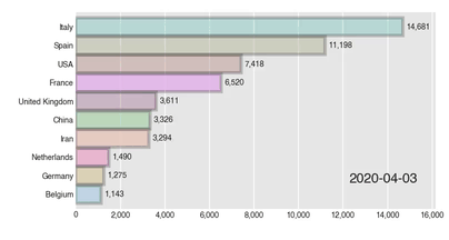
import bar_chart_race as bcr
# 获取数据
df = bcr.load_dataset('covid19_tutorial')
# 生成GIF图像
bcr.bar_chart_race(df, 'covid19_horiz.gif')
实际上bar_chart_race还有很多参数可以输出不同形态的gif
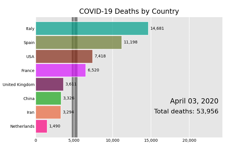
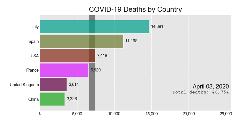
bcr.bar_chart_race(
    df=df,
    filename='covid19_horiz.mp4',
    orientation='h',
    sort='desc',
    n_bars=6,
    fixed_order=False,
    fixed_max=True,
    steps_per_period=10,
    interpolate_period=False,
    label_bars=True,
    bar_size=.95,
    period_label={'x': .99, 'y': .25, 'ha': 'right', 'va': 'center'},
    period_fmt='%B %d, %Y',
    period_summary_func=lambda v, r: {'x': .99, 'y': .18,
                                      's': f'Total deaths: {v.nlargest(6).sum():,.0f}',
                                      'ha': 'right', 'size': 8, 'family': 'Courier New'},
    perpendicular_bar_func='median',
    period_length=500,
    figsize=(5, 3),
    dpi=144,
    cmap='dark12',
    title='COVID-19 Deaths by Country',
    title_size='',
    bar_label_size=7,
    tick_label_size=7,
    shared_fontdict={'family' : 'Helvetica', 'color' : '.1'},
    scale='linear',
    writer=None,
    fig=None,
    bar_kwargs={'alpha': .7},
    filter_column_colors=False)
比如以下几种
_20211224104849.gif)
_20211224104849.gif)
更详细的用法大家可以查阅官方文档
地址:https://www.dexplo.org/bar_chart_race/
streamlit+bar_chart_race
streamlit是我最近特别喜欢玩的一个机器学习应用开发框架,它能帮你不用懂得复杂的HTML,CSS等前端技术就能快速做出来一个炫酷的Web APP。
我之前开发的决策树挑西瓜就是使用了streamlit
下面是streamlit+bar_chart_race整体结构
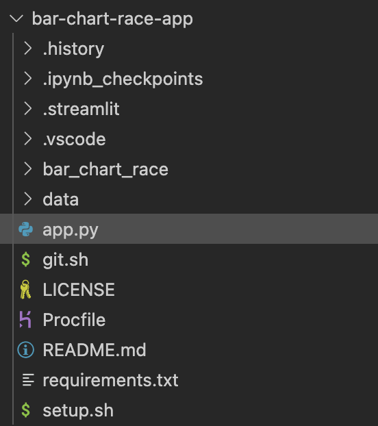
核心是app.py,代码如下:
from bar_chart_race import bar_chart_race as bcr
import pandas as pd
import streamlit as st
import streamlit.components.v1 as components

st.title('Bar Chart Race', anchor=None)
uploaded_file = st.file_uploader("", type="csv")

if uploaded_file is not None:
    df = pd.read_csv(uploaded_file,sep=',', encoding='gbk')
    df = df.set_index("date")
    st.write(df.head(6))
    bcr_html = bcr.bar_chart_race(df=df, n_bars=10)
    components.html(bcr_html.data, width=800, height=600)
最终效果大家亲自体验吧:
https://bar-chart-race-app.herokuapp.com/
三连在看,年入百万。下期开讲白嫖服务器+部署,敬请期待。
标签:条形,bar,Python,全网,chart,df,race,ax,size 来源: https://www.cnblogs.com/jpld/p/15753458.html
本站声明: 1. iCode9 技术分享网(下文简称本站)提供的所有内容,仅供技术学习、探讨和分享; 2. 关于本站的所有留言、评论、转载及引用,纯属内容发起人的个人观点,与本站观点和立场无关; 3. 关于本站的所有言论和文字,纯属内容发起人的个人观点,与本站观点和立场无关; 4. 本站文章均是网友提供,不完全保证技术分享内容的完整性、准确性、时效性、风险性和版权归属;如您发现该文章侵犯了您的权益,可联系我们第一时间进行删除; 5. 本站为非盈利性的个人网站,所有内容不会用来进行牟利,也不会利用任何形式的广告来间接获益,纯粹是为了广大技术爱好者提供技术内容和技术思想的分享性交流网站。