标签:示例 solid after content position border css before
1.指定文本前后添加内容
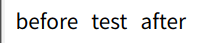
<div class="box">test</div>.box::before{
content: 'before';
margin-right:10px ;
}
.box::after{
content: 'after';
margin-left:10px ;
}2. 实现一个书签标记logo
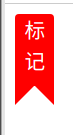
<div class="mark">
    标<br>记
</div>
.mark{
width: 30px;
height: 55px;
color: #fff;
border-radius: 3px 3px 0 0;
background-color: red;
text-align: center;
position: relative;
&::after,&::before{
position: absolute;
content: '';
display: block;
border: 15px solid transparent;
}
&::after{
right: 0;
border-right: 15px solid red;
bottom: -15px;
}
&::before{
left: 0;
border-left: 15px solid red;
bottom: -15px;
}
}3.文字前后自动加上引号
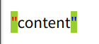
<div class="code">
    content
</div>
.code{
margin-top: 20px;
&::before{
content: "\"";
color: red;
}
&::after{
content: "\"";
color: blue;
}
&:hover{
&::before,&::after{
background-color: yellowgreen;
}
}
}4.自定义样式实现checkbox
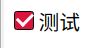
<label for="moreAction">
    <input id="moreAction" type="checkbox">
    <span class="fw-checkbox"></span>
    <span>测试</span>
</label>
#moreAction{
display: none;
}
.fw-checkbox{
position: relative;
display: inline-block;
box-sizing: border-box;
width: 15px;
height: 15px;
border: 1px solid #000;
border-radius: 2px;
}
#moreAction[type="checkbox"]:checked{
+.fw-checkbox{
background-color: crimson;
}
+.fw-checkbox::before{
position: absolute;
display: inline-block;
content: '';
width: 6px;
height: 10px;
border-right: 2px solid #fff;
border-bottom: 2px solid #fff;
transform: rotate(45deg);
left: 3px;
bottom: 3px;
}
}- 简单实现一个聊天气泡
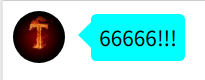
<div class="bubble">
    <img src="http://img.cdn.sugarat.top/mdImg/MTU3OTY5OTUwMDM1Mw==579699500353" alt="">
    <div class="chat">66666!!!</div>
</div>
.bubble{
display: flex;
align-items: center;
img{
width: 40px;
height: 40px;
border-radius: 50%;
margin-right: 20px;
}
.chat{
position: relative;
background-color: cyan;
padding: 6px;
border-radius: 4px;
box-sizing: border-box;
&::before{
content: '';
position: absolute;
left: -20px;
border: 10px solid transparent;
border-right: 10px solid cyan;
}
}
}6. 相片堆叠
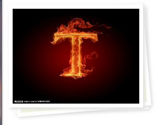
 <div class="img-area">
    <div class="pic">
            <img src="http://img.cdn.sugarat.top/mdImg/MTU3OTY5OTUwMDM1Mw==579699500353" alt="">
        </div>
</div>
.pic{
position: relative;
img{
width: 100%;
height: 100%;
}
}
.pic,
.pic::after,
.pic::before{
width: 200px;
height: 150px;
border: 6px solid #fff;
box-shadow: 2px 2px 5px #ddd;
}
.pic::after,
.pic::before{
content: '';
position: absolute;
background:#eff4de ;
border: 6px solid #fff;
}
.pic::after{
transform: rotate(-2deg);
z-index: -2;
left: 0px;
}
.pic::before{
transform: rotate(-5deg);
z-index: -1;
left: 0px;
}参考链接
标签:示例,solid,after,content,position,border,css,before 来源: https://www.cnblogs.com/roseAT/p/12229722.html
本站声明: 1. iCode9 技术分享网(下文简称本站)提供的所有内容,仅供技术学习、探讨和分享; 2. 关于本站的所有留言、评论、转载及引用,纯属内容发起人的个人观点,与本站观点和立场无关; 3. 关于本站的所有言论和文字,纯属内容发起人的个人观点,与本站观点和立场无关; 4. 本站文章均是网友提供,不完全保证技术分享内容的完整性、准确性、时效性、风险性和版权归属;如您发现该文章侵犯了您的权益,可联系我们第一时间进行删除; 5. 本站为非盈利性的个人网站,所有内容不会用来进行牟利,也不会利用任何形式的广告来间接获益,纯粹是为了广大技术爱好者提供技术内容和技术思想的分享性交流网站。