标签:轮播 feel slides nth radio input type 很丝滑 color
前言
轮播图经常会在项目里用到,但是实际上用到的轮播图都是比较简单的,没有复杂的特效,这个时候如果去引入swiper那些库的话,未免就有点杀鸡焉用牛刀了。
所以不如自己手写一个,而今天我要分享的一种写法也是我最近才发现的,发现写起来真的是很丝滑,只纯css就实现了呢!
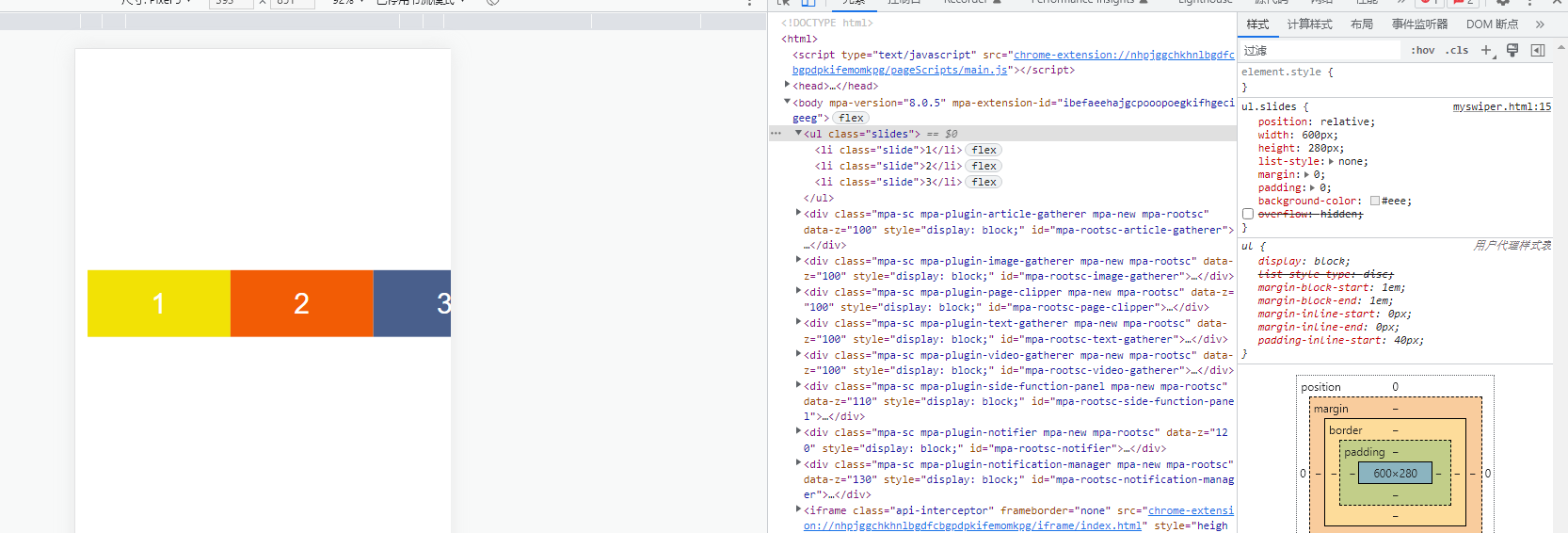
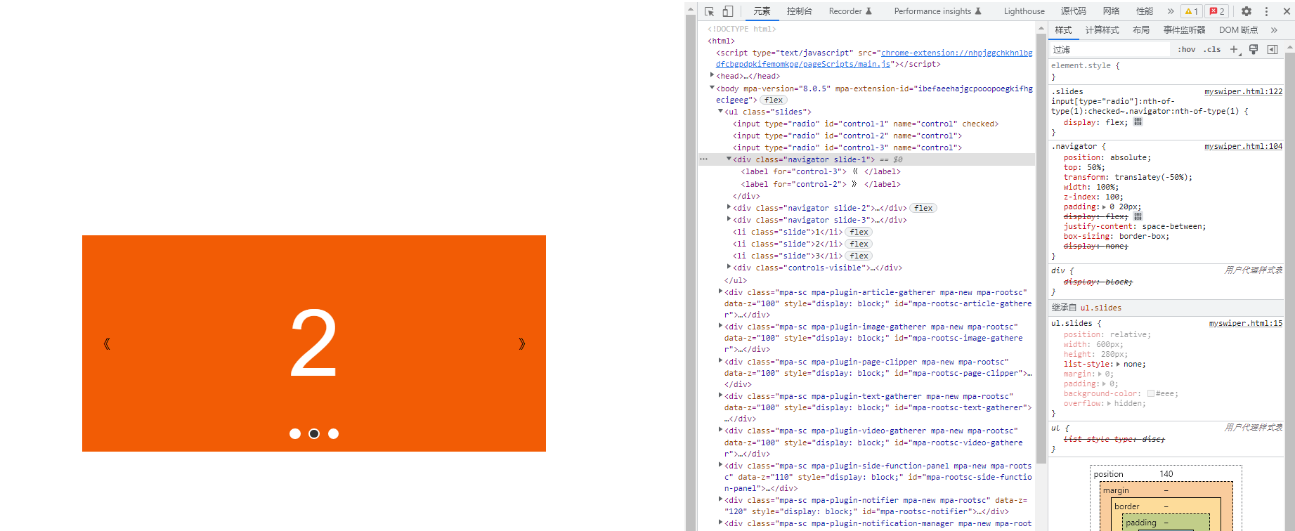
可以先看看预览效果
预览地址:https://sunny-lucking.github.io/howToBuiMySwiper/myswiper.html
源码地址:https://github.com/Sunny-lucking/howToBuiMySwiper/blob/main/myswiper.html
HTML <label> 标签的 for 属性的用法及作用
for 属性规定 label 与哪个表单元素绑定,label的for属性要与绑定表单元素(input)的ID对应。绑定完成后可以通过点击label触发表单元素的默认属性。通俗的讲就是你绑定完了点lebel就相当于点击表单元素(input)。
<form>
  <label for="male">Male</label>
  <input type="radio" name="sex" id="male" />
  <br />
  <label for="female">Female</label>
  <input type="radio" name="sex" id="female" />
</form>
开始实现吧
<!DOCTYPE html>
<html>

<head>
  <meta charset="utf-8">
  <title>我的轮播图</title>
  <style>
    body {
      display: flex;
      justify-content: center;
      align-items: center;
      min-height: 100vh;
    }

    ul.slides {
      position: relative;
      width: 600px;
      height: 280px;
      list-style: none;
      margin: 0;
      padding: 0;
      background-color: #eee;
    }

    li.slide {
      margin: 0;
      padding: 0;
      width: inherit;
      height: inherit;
      position: absolute;
      top: 0;
      left: 0;
      display: flex;
      justify-content: center;
      align-items: center;
      font-family: Helvetica;
      font-size: 120px;
      color: #fff;
      transition: .5s transform ease-in-out;
    }

    .slide:nth-of-type(1) {
      background-color: #F2E205;
    }

    .slide:nth-of-type(2) {
      background-color: #F25C05;
      left: 100%;
    }
    .slide:nth-of-type(3) {
      background-color: #495F8C;
      left: 200%;
    }
  </style>
</head>

<body>
  <ul class="slides">
    <li class="slide">1</li>
    <li class="slide">2</li>
    <li class="slide">3</li>
  </ul>
</body>

</html>
首先先写了所需要的三个子元素。分别给了三种颜色。
接下来。最外层加上overflow: hidden,让只显示一个slide子元素
ul.slides {
      position: relative;
      width: 600px;
      height: 280px;
      list-style: none;
      margin: 0;
      padding: 0;
      background-color: #eee;
      overflow: hidden;
    }

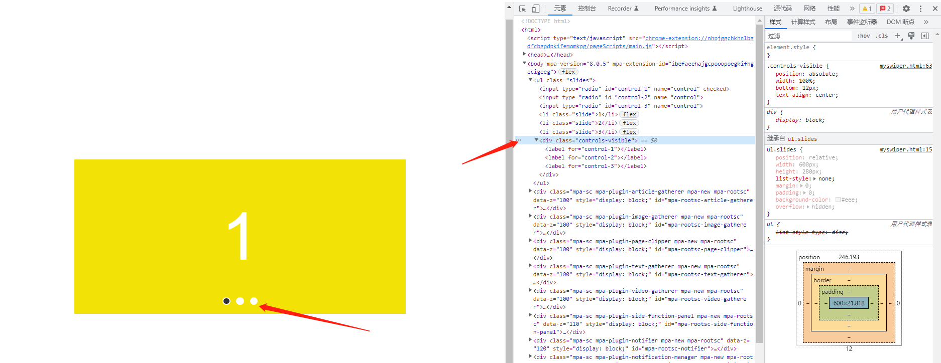
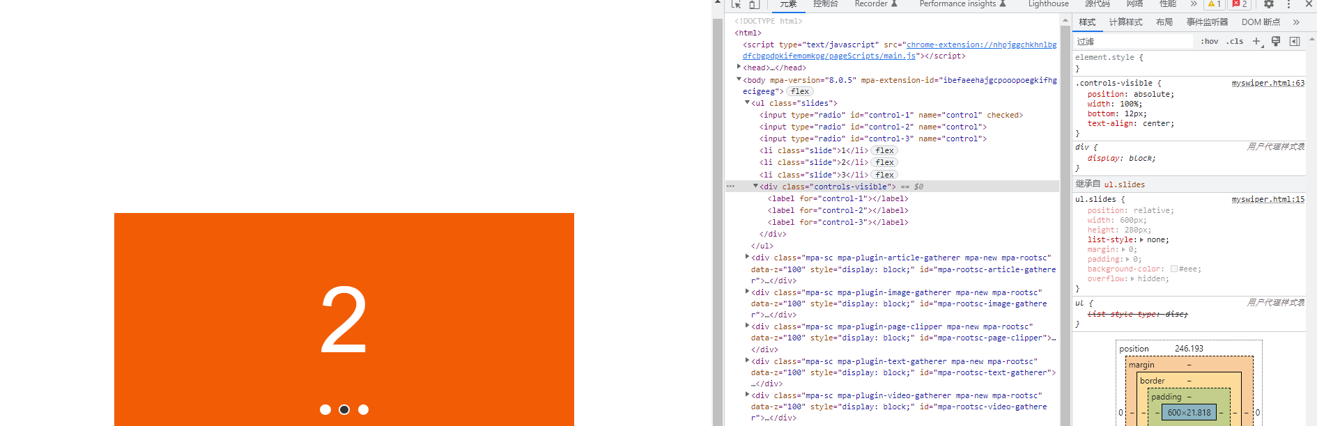
接下来,加上label和input起到控制切换的效果
html
<body>
  <ul class="slides">
    <input type="radio" id="control-1" name="control" checked>
    <input type="radio" id="control-2" name="control">
    <input type="radio" id="control-3" name="control">
    <li class="slide">1</li>
    <li class="slide">2</li>
    <li class="slide">3</li>
    <div class="controls-visible">
      <label for="control-1"></label>
      <label for="control-2"></label>
      <label for="control-3"></label>
    </div>
  </ul>
</body>
css
input[type="radio"] {
  position: relative;
  z-index: 100;
  display: none;
}

.controls-visible {
  position: absolute;
  width: 100%;
  bottom: 12px;
  text-align: center;
}

.controls-visible label {
  display: inline-block;
  width: 10px;
  height: 10px;
  background-color: #fff;
  border-radius: 50%;
  margin: 0 3px;
  border: 2px solid #fff;
}

.slides input[type="radio"]:nth-of-type(1):checked ~ .controls-visible label:nth-of-type(1) {
  background-color: #333;
}

.slides input[type="radio"]:nth-of-type(2):checked ~ .controls-visible label:nth-of-type(2) {
  background-color: #333;
}

.slides input[type="radio"]:nth-of-type(3):checked ~ .controls-visible label:nth-of-type(3) {
  background-color: #333;
}
这里利用input和label来模拟轮播图的pagination分页功能。label模拟的是圆点,然后把radio输入框隐藏了。radio放在最前面的目的是为了用了控制后面的slides 和controls的 样式
现在实现点击label切换轮播图的效果
.slides input[type="radio"]:nth-of-type(1):checked ~ .slide {
  transform: translatex(0%);
}

.slides input[type="radio"]:nth-of-type(2):checked ~ .slide {
  transform: translatex(-100%);
}

.slides input[type="radio"]:nth-of-type(3):checked ~ .slide {
  transform: translatex(-200%);
}
可以看到已经非常地简单就实现了点击lebel切换轮播图的效果。
当然,我们要实现一个上下页切换的功能也非常简单
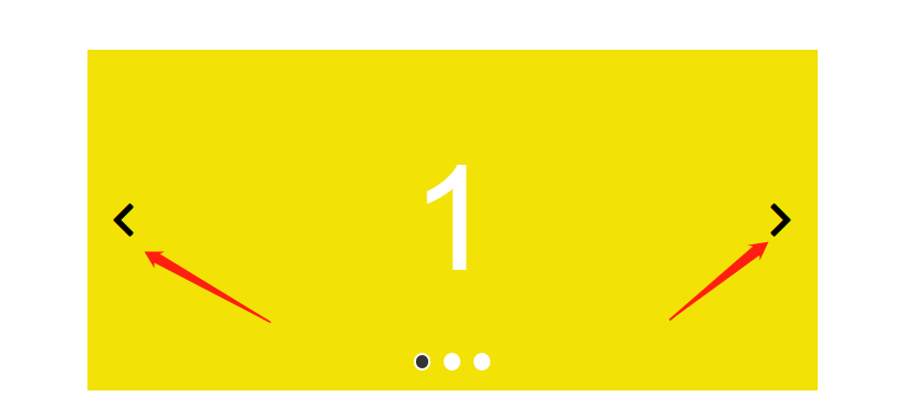
我们添加三组navigator,一页页面对应一组
<body>
  <ul class="slides">
    <input type="radio" id="control-1" name="control" checked>
    <input type="radio" id="control-2" name="control">
    <input type="radio" id="control-3" name="control">
    <div class="navigator slide-1">
      <label for="control-3">
        《
      </label>
      <label for="control-2">
        》
      </label>
    </div>

    <div class="navigator slide-2">
      <label for="control-1">
        《
      </label>
      <label for="control-3">
        》
      </label>
    </div>

    <div class="navigator slide-3">
      <label for="control-2">
        《
      </label>
      <label for="control-1">
        》
      </label>
    </div>
    <li class="slide">1</li>
    <li class="slide">2</li>
    <li class="slide">3</li>
    <div class="controls-visible">
      <label for="control-1"></label>
      <label for="control-2"></label>
      <label for="control-3"></label>
    </div>
  </ul>
</body>
我们要把不属于当前的那一页的navigator隐藏掉,所以用display:none,当选中对应的页面的时候,再让它显示出来,所以可以这样实现
    .navigator {
      position: absolute;
      top: 50%;
      transform: translatey(-50%);
      width: 100%;
      z-index: 100;
      padding: 0 20px;
      display: flex;
      justify-content: space-between;
      box-sizing: border-box;
      display: none;
    }

    .navigator {
      font-size: 32px;
      color #333333;
    }

    .slides input[type="radio"]:nth-of-type(1):checked~.navigator:nth-of-type(1) {
      display: flex;
    }

    .slides input[type="radio"]:nth-of-type(2):checked~.navigator:nth-of-type(2) {
      display: flex;
    }

    .slides input[type="radio"]:nth-of-type(3):checked~.navigator:nth-of-type(3) {
      display: flex;
    }
可以看到,又轻而易举就实现了点击切换上下页的功能,太腻害了。
标签:轮播,feel,slides,nth,radio,input,type,很丝滑,color 来源: https://www.cnblogs.com/sunny-lucky/p/16379314.html
本站声明: 1. iCode9 技术分享网(下文简称本站)提供的所有内容,仅供技术学习、探讨和分享; 2. 关于本站的所有留言、评论、转载及引用,纯属内容发起人的个人观点,与本站观点和立场无关; 3. 关于本站的所有言论和文字,纯属内容发起人的个人观点,与本站观点和立场无关; 4. 本站文章均是网友提供,不完全保证技术分享内容的完整性、准确性、时效性、风险性和版权归属;如您发现该文章侵犯了您的权益,可联系我们第一时间进行删除; 5. 本站为非盈利性的个人网站,所有内容不会用来进行牟利,也不会利用任何形式的广告来间接获益,纯粹是为了广大技术爱好者提供技术内容和技术思想的分享性交流网站。