标签:尝试 教程 表格 Bootstrap 实例 w3cschool 按钮 btn
Bootstrap 简介
什么是 Bootstrap?
Bootstrap 是一个用于快速开发 Web 应用程序和网站的前端框架。Bootstrap 是基于 HTML、CSS、JAVASCRIPT 的。
Bootstrap 目前的最新版本是 Bootstrap4,利用我们提供的 Sass 变量和大量 mixin、响应式栅格系统、可扩展的预制组件、基于 jQuery 的强大的插件系统,能够快速为你的想法开发出原型或者构建整个 app 。
历史
Bootstrap 是由 Twitter 的 Mark Otto 和 Jacob Thornton 开发的。Bootstrap 是 2011 年八月在 GitHub 上发布的开源产品。
为什么使用 Bootstrap?
-
移动设备优先:自 Bootstrap 3 起,框架包含了贯穿于整个库的移动设备优先的样式。
-
浏览器支持:所有的主流浏览器都支持 Bootstrap。


-
容易上手:只要您具备 HTML 和 CSS 的基础知识,您就可以开始学习 Bootstrap。
-
响应式设计:Bootstrap 的响应式 CSS 能够自适应于台式机、平板电脑和手机。

-
它为开发人员创建接口提供了一个简洁统一的解决方案。
-
它包含了功能强大的内置组件,易于定制。
-
它还提供了基于 Web 的定制。
-
它是开源的。
Bootstrap 包的内容
-
基本结构:Bootstrap 提供了一个带有网格系统、链接样式、背景的基本结构。这将在 Bootstrap 基本结构 部分详细讲解。
-
CSS:Bootstrap 自带以下特性:全局的 CSS 设置、定义基本的 HTML 元素样式、可扩展的 class,以及一个先进的网格系统。这将在 Bootstrap CSS 部分详细讲解。
-
组件:Bootstrap 包含了十几个可重用的组件,用于创建图像、下拉菜单、导航、警告框、弹出框等等。这将在 布局组件 部分详细讲解。
-
JavaScript 插件:Bootstrap 包含了十几个自定义的 jQuery 插件。您可以直接包含所有的插件,也可以逐个包含这些插件。这将在 Bootstrap 插件 部分详细讲解。
-
定制:您可以定制 Bootstrap 的组件、LESS 变量和 jQuery 插件来得到您自己的版本。
在线实例
本站的 Bootstrap 教程包含了上百个实例。
你可以使用我们的在线编辑器在线编辑代码,并点击运行按钮查看结果。
Bootstrap 实例
<div class="container"><div class="jumbotron">
<h1>我的第一个 Bootstrap 页面</h1>
<p>重置窗口大小,查看响应式效果!</p>
</div>
<div class="row">
<div class="col-sm-4">
<h3>Column 1</h3>
<p>学技术,从W3Cschool开始!</p>
</div>
<div class="col-sm-4">
<h3>Column 2</h3>
<p>学技术,从W3Cschool开始!</p>
</div>
<div class="col-sm-4">
<h3>Column 3</h3>
<p>学技术,从W3Cschool开始!</p>
</div>
</div>
</div>
Bootstrap 环境安装
Bootstrap 安装是非常容易的。本章将讲解如何下载并安装 Bootstrap,讨论 Bootstrap 文件结构,并通过一个实例演示它的用法。
下载 Bootstrap
您可以从 http://getbootstrap.com/ 上下载 Bootstrap 的最新版本。当您点击这个链接时,您将看到如下所示的网页:

您会看到两个按钮:
- Download Bootstrap:下载 Bootstrap。点击该按钮,您可以下载 Bootstrap CSS、JavaScript 和字体的预编译的压缩版本。不包含文档和最初的源代码文件。
- Download Source:下载源代码。点击该按钮,您可以直接从 from 上得到最新的 Bootstrap LESS 和 JavaScript 源代码。
如果您使用的是未编译的源代码,您需要编译 LESS 文件来生成可重用的 CSS 文件。对于编译 LESS 文件,Bootstrap 官方只支持 Recess,这是 Twitter 的基于 less.js 的 CSS 提示。
为了更好的了解和更方便的使用,我们将在本教程中使用 Bootstrap 的预编译版本。
由于文件是被编译过和压缩过的,在独立的功能开发中,您不必每次都包含这些独立的文件。
本教程编写时,使用的是Bootstrap 3。
文件结构
预编译的 Bootstrap
当您下载了 Bootstrap 的已编译的版本,解压缩 ZIP 文件,您将看到下面的文件/目录结构:
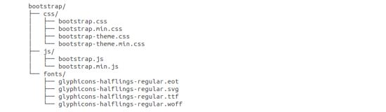
如上图所示,可以看到已编译的 CSS 和 JS(bootstrap.*),以及已编译压缩的 CSS 和 JS(bootstrap.min.*)。同时也包含了 Glyphicons 的字体,这是一个可选的 Bootstrap 主题。
Bootstrap 源代码
如果您下载了 Bootstrap 源代码,那么文件结构将如下所示:
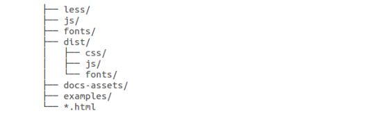
- less/、js/ 和 fonts/ 下的文件分别是 Bootstrap CSS、JS 和图标字体的源代码。
- dist/ 文件夹包含了上面预编译下载部分中所列的文件和文件夹。
- docs-assets/、examples/ 和所有的 *.html 文件是 Bootstrap 文档。
Bootstrap 排版
Bootstrap 使用 Helvetica Neue、 Helvetica、 Arial 和 sans-serif 作为其默认的字体栈。
使用 Bootstrap 的排版特性,您可以创建标题、段落、列表及其他内联元素。
标题
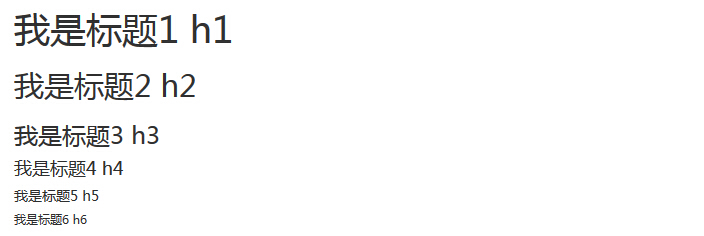
Bootstrap 中定义了所有的 HTML 标题(h1 到 h6)的样式。请看下面的实例:
<!DOCTYPE html>
<html>
<head>
   <title>Bootstrap 实例 - 标题</title>
   <link href="//cdn.bootcss.com/bootstrap/3.3.6/css/bootstrap.min.css" rel="external nofollow" target="_blank"  rel="external nofollow" target="_blank"  rel="external nofollow" target="_blank"  rel="external nofollow" target="_blank"  rel="external nofollow" target="_blank"  rel="external nofollow" target="_blank"  rel="external nofollow" target="_blank"  rel="external nofollow" target="_blank"  rel="stylesheet">
   <script src="//cdn.bootcss.com/jquery/2.1.1/jquery.min.js" rel="external nofollow"  rel="external nofollow"  rel="external nofollow"  rel="external nofollow"  rel="external nofollow"  rel="external nofollow"  rel="external nofollow"  rel="external nofollow" ></script>
   <script src="//cdn.bootcss.com/bootstrap/3.3.6/js/bootstrap.min.js" rel="external nofollow"  rel="external nofollow"  rel="external nofollow"  rel="external nofollow"  rel="external nofollow"  rel="external nofollow"  rel="external nofollow"  rel="external nofollow" ></script>
</head>
<body>
   <h1>我是标题1 h1</h1>
   <h2>我是标题2 h2</h2>
   <h3>我是标题3 h3</h3>
   <h4>我是标题4 h4</h4>
   <h5>我是标题5 h5</h5>
   <h6>我是标题6 h6</h6>
</body>
</html>
结果如下所示:
Bootstrap 表格
本节学习如何通过Bootstrap创建表格,在此之前,你可以先了解在HTML表格是如何创建的!
Bootstrap 提供了一个清晰的创建表格的布局。下表列出了 Bootstrap 支持的一些表格元素:
| 标签 | 描述 |
|---|---|
| <table> | 为表格添加基础样式。 |
| <thead> | 表格标题行的容器元素(<tr>),用来标识表格列。 |
| <tbody> | 表格主体中的表格行的容器元素(<tr>)。 |
| <tr> | 一组出现在单行上的表格单元格的容器元素(<td> 或 <th>)。 |
| <td> | 默认的表格单元格。 |
| <th> | 特殊的表格单元格,用来标识列或行(取决于范围和位置)。必须在 <thead> 内使用。 |
| <caption> | 关于表格存储内容的描述或总结。 |
表格类
下表样式可用于表格中:
| 类 | 描述 | 实例 |
|---|---|---|
| .table | 为任意 <table> 添加基本样式 (只有横向分隔线) | 尝试一下 |
| .table-striped | 在 <tbody> 内添加斑马线形式的条纹 ( IE8 不支持) | 尝试一下 |
| .table-bordered | 为所有表格的单元格添加边框 | 尝试一下 |
| .table-hover | 在 <tbody> 内的任一行启用鼠标悬停状态 | 尝试一下 |
| .table-condensed | 让表格更加紧凑 | 尝试一下 |
| 联合使用所有表格类 | 尝试一下 | |
<tr>, <th> 和 <td> 类
下表的类可用于表格的行或者单元格:
| 类 | 描述 | 实例 |
|---|---|---|
| .active | 将悬停的颜色应用在行或者单元格上 | 尝试一下 |
| .success | 表示成功的操作 | 尝试一下 |
| .info | 表示信息变化的操作 | 尝试一下 |
| .warning | 表示一个警告的操作 | 尝试一下 |
| .danger | 表示一个危险的操作 | 尝试一下 |
基本的表格
如果您想要一个只带有内边距(padding)和水平分割的基本表,请添加 class .table,如下面实例所示:
<!DOCTYPE html><html><head>
   <title>Bootstrap 实例 - 基本的表格</title>
   <link href="//cdn.bootcss.com/bootstrap/3.3.6/css/bootstrap.min.css" rel="external nofollow" target="_blank"  rel="external nofollow" target="_blank"  rel="external nofollow" target="_blank"  rel="external nofollow" target="_blank"  rel="external nofollow" target="_blank"  rel="external nofollow" target="_blank"  rel="external nofollow" target="_blank"  rel="stylesheet">
   <script src="//cdn.bootcss.com/jquery/2.1.1/jquery.min.js" rel="external nofollow"  rel="external nofollow"  rel="external nofollow"  rel="external nofollow"  rel="external nofollow"  rel="external nofollow"  rel="external nofollow" ></script>
   <script src="//cdn.bootcss.com/bootstrap/3.3.6/js/bootstrap.min.js" rel="external nofollow"  rel="external nofollow"  rel="external nofollow"  rel="external nofollow"  rel="external nofollow"  rel="external nofollow"  rel="external nofollow" ></script></head><body><table class="table">
   <caption>基本的表格布局</caption>
   <thead>
      <tr>
         <th>名称</th>
         <th>城市</th>
      </tr>
   </thead>
   <tbody>
      <tr>
         <td>Tanmay</td>
         <td>Bangalore</td>
      </tr>
      <tr>
         <td>Sachin</td>
         <td>Mumbai</td>
      </tr>
   </tbody></table></body></html>
Bootstrap 表单
在本章中,我们将学习如何使用 Bootstrap 创建表单。Bootstrap 通过一些简单的 HTML 标签和扩展的类即可创建出不同样式的表单。
表单布局
Bootstrap 提供了下列类型的表单布局:
-
垂直表单(默认)
-
内联表单
-
水平表单
垂直或基本表单
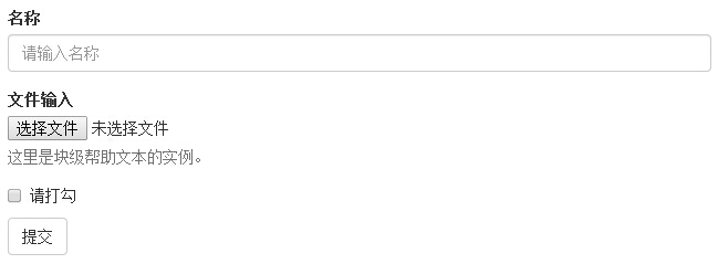
基本的表单结构是 Bootstrap 自带的,个别的表单控件自动接收一些全局样式。下面列出了创建基本表单的步骤:
-
向父 <form> 元素添加 role="form"。
-
把标签和控件放在一个带有 class .form-group 的 <div> 中。这是获取最佳间距所必需的。
-
向所有的文本元素 <input>、<textarea> 和 <select> 添加 class .form-control。
<!DOCTYPE html><html><head>
   <title>Bootstrap 实例 - 基本表单</title>
   <link rel="stylesheet" href="//apps.bdimg.com/libs/bootstrap/3.3.0/css/bootstrap.min.css" rel="external nofollow" target="_blank"  rel="external nofollow" target="_blank"  rel="external nofollow" target="_blank"  rel="external nofollow" target="_blank"  rel="external nofollow" target="_blank"  rel="external nofollow" target="_blank"  rel="external nofollow" target="_blank"  rel="external nofollow" target="_blank"  rel="external nofollow" target="_blank"  rel="external nofollow" target="_blank"  rel="external nofollow" target="_blank" >
   <script src="//apps.bdimg.com/libs/jquery/2.1.1/jquery.min.js" rel="external nofollow"  rel="external nofollow"  rel="external nofollow"  rel="external nofollow"  rel="external nofollow"  rel="external nofollow"  rel="external nofollow"  rel="external nofollow"  rel="external nofollow"  rel="external nofollow"  rel="external nofollow" ></script>
   <script src="//apps.bdimg.com/libs/bootstrap/3.3.0/js/bootstrap.min.js" rel="external nofollow"  rel="external nofollow"  rel="external nofollow"  rel="external nofollow"  rel="external nofollow"  rel="external nofollow"  rel="external nofollow"  rel="external nofollow"  rel="external nofollow"  rel="external nofollow"  rel="external nofollow" ></script></head><body><form role="form">
   <div class="form-group">
      <label for="name">名称</label>
      <input type="text" class="form-control" id="name"
         placeholder="请输入名称">
   </div>
   <div class="form-group">
      <label for="inputfile">文件输入</label>
      <input type="file" id="inputfile">
      <p class="help-block">这里是块级帮助文本的实例。</p>
   </div>
   <div class="checkbox">
      <label>
      <input type="checkbox"> 请打勾      </label>
   </div>
   <button type="submit" class="btn btn-default">提交</button></form></body></html>
结果如下所示:
Bootstrap 按钮
本章将通过实例讲解如何使用 Bootstrap 按钮。任何带有 class .btn 的元素都会继承圆角灰色按钮的默认外观。但是 Bootstrap 提供了一些选项来定义按钮的样式,具体如下表所示:
以下样式可用于<a>, <button>, 或 <input> 元素上:
| 类 | 描述 | 实例 |
|---|---|---|
| .btn | 为按钮添加基本样式 | 尝试一下 |
| .btn-default | 默认/标准按钮 | 尝试一下 |
| .btn-primary | 原始按钮样式(未被操作) | 尝试一下 |
| .btn-success | 表示成功的动作 | 尝试一下 |
| .btn-info | 该样式可用于要弹出信息的按钮 | 尝试一下 |
| .btn-warning | 表示需要谨慎操作的按钮 | 尝试一下 |
| .btn-danger | 表示一个危险动作的按钮操作 | 尝试一下 |
| .btn-link | 让按钮看起来像个链接 (仍然保留按钮行为) | 尝试一下 |
| .btn-lg | 制作一个大按钮 | 尝试一下 |
| .btn-sm | 制作一个小按钮 | 尝试一下 |
| .btn-xs | 制作一个超小按钮 | 尝试一下 |
| .btn-block | 块级按钮(拉伸至父元素100%的宽度) | 尝试一下 |
| .active | 按钮被点击 | 尝试一下 |
| .disabled | 禁用按钮 | 尝试一下 |
下面的实例演示了上面所有的按钮 class:
<!DOCTYPE html><html><head>
   <title>Bootstrap 实例 - 按钮选项</title>
   <link rel="stylesheet" href="//apps.bdimg.com/libs/bootstrap/3.3.0/css/bootstrap.min.css" rel="external nofollow" target="_blank"  rel="external nofollow" target="_blank"  rel="external nofollow" target="_blank"  rel="external nofollow" target="_blank"  rel="external nofollow" target="_blank" >
   <script src="//apps.bdimg.com/libs/jquery/2.1.1/jquery.min.js" rel="external nofollow"  rel="external nofollow"  rel="external nofollow"  rel="external nofollow"  rel="external nofollow" ></script>
   <script src="//apps.bdimg.com/libs/bootstrap/3.3.0/js/bootstrap.min.js" rel="external nofollow"  rel="external nofollow"  rel="external nofollow"  rel="external nofollow"  rel="external nofollow" ></script></head><body>
<!-- 标准的按钮 -->
<button type="button" class="btn btn-default">默认按钮</button>
<!-- 提供额外的视觉效果,标识一组按钮中的原始动作 -->
<button type="button" class="btn btn-primary">原始按钮</button>
<!-- 表示一个成功的或积极的动作 -->
<button type="button" class="btn btn-success">成功按钮</button>
<!-- 信息警告消息的上下文按钮 -->
<button type="button" class="btn btn-info">信息按钮</button>
<!-- 表示应谨慎采取的动作 -->
<button type="button" class="btn btn-warning">警告按钮</button>
<!-- 表示一个危险的或潜在的负面动作 -->
<button type="button" class="btn btn-danger">危险按钮</button>
<!-- 并不强调是一个按钮,看起来像一个链接,但同时保持按钮的行为 -->
<button type="button" class="btn btn-link">链接按钮</button>
</body></html>
结果如下所示:

Bootstrap 图片
在本章中,我们将学习 Bootstrap 对图片的支持。Bootstrap 提供了三个可对图片应用简单样式的 class:
- .img-rounded:添加 border-radius:6px 来获得图片圆角。
- .img-circle:添加 border-radius:500px 来让整个图片变成圆形。
- .img-thumbnail:添加一些内边距(padding)和一个灰色的边框。
请看下面的实例演示:
<!DOCTYPE html>
<html>
<head>
   <title>Bootstrap 实例 - 图片</title>
   <link href="//cdn.bootcss.com/bootstrap/3.3.6/css/bootstrap.min.css" rel="external nofollow" target="_blank"  rel="stylesheet">
   <script src="//cdn.bootcss.com/jquery/2.1.1/jquery.min.js" rel="external nofollow" ></script>
   <script src="//cdn.bootcss.com/bootstrap/3.3.6/js/bootstrap.min.js" rel="external nofollow" ></script>
</head>
<body>

<img src="https://www.w3cschool.cn/statics/demosource/download.png" class="img-rounded">
<img src="https://www.w3cschool.cn/statics/demosource/download.png" class="img-circle">
<img src="https://www.w3cschool.cn/statics/demosource/download.png" class="img-thumbnail">

</body>
</html>
结果如下所示:

<img> 类
以下类可用于任何图片中。
| 类 | 描述 | 实例 |
|---|---|---|
| .img-rounded | 为图片添加圆角 (IE8 不支持) | 尝试一下 |
| .img-circle | 将图片变为圆形 (IE8 不支持) | 尝试一下 |
| .img-thumbnail | 缩略图功能 | 尝试一下 |
| .img-responsive | 图片响应式 (将很好地扩展到父元素) | 尝试一下 |
响应式图片
通过在 <img> 标签添加 .img-responsive 类来让图片支持响应式设计。 图片将很好地扩展到父元素。
.img-responsive 类将 max-width: 100%; 和 height: auto; 样式应用在图片上:
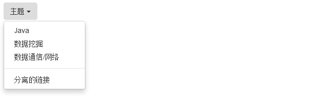
Bootstrap 下拉菜单(Dropdowns)
本章将重点介绍 Bootstrap 下拉菜单。下拉菜单是可切换的,是以列表格式显示链接的上下文菜单。这可以通过与 下拉菜单(Dropdown) JavaScript 插件 的互动来实现。
如需使用下拉菜单,只需要在 class .dropdown 内加上下拉菜单即可。下面的实例演示了基本的下拉菜单:
<!DOCTYPE html><html><head>
   <title>Bootstrap 实例 - 下拉菜单(Dropdowns)</title>
   <link href="//cdn.bootcss.com/bootstrap/3.3.6/css/bootstrap.min.css" rel="external nofollow" target="_blank"  rel="external nofollow" target="_blank"  rel="external nofollow" target="_blank"  rel="stylesheet">
   <script src="//cdn.bootcss.com/jquery/2.1.1/jquery.min.js" rel="external nofollow"  rel="external nofollow"  rel="external nofollow" ></script>
   <script src="//cdn.bootcss.com/bootstrap/3.3.6/js/bootstrap.min.js" rel="external nofollow"  rel="external nofollow"  rel="external nofollow" ></script></head><body><div class="dropdown">
   <button type="button" class="btn dropdown-toggle" id="dropdownMenu1"
      data-toggle="dropdown">
      主题      <span class="caret"></span>
   </button>
   <ul class="dropdown-menu" role="menu" aria-labelledby="dropdownMenu1">
      <li role="presentation">
         <a role="menuitem" tabindex="-1" href="#">Java</a>
      </li>
      <li role="presentation">
         <a role="menuitem" tabindex="-1" href="#">数据挖掘</a>
      </li>
      <li role="presentation">
         <a role="menuitem" tabindex="-1" href="#">
            数据通信/网络         </a>
      </li>
      <li role="presentation" class="divider"></li>
      <li role="presentation">
         <a role="menuitem" tabindex="-1" href="#">分离的链接</a>
      </li>
   </ul></div></body></html>
结果如下所示:
Bootstrap 导航栏
导航栏是一个很好的功能,是 Bootstrap 网站的一个突出特点。导航栏在您的应用或网站中作为导航页头的响应式基础组件。导航栏在移动设备的视图中是折叠的,随着可用视口宽度的增加,导航栏也会水平展开。在 Bootstrap 导航栏的核心中,导航栏包括了站点名称和基本的导航定义样式。
默认的导航栏
创建一个默认的导航栏的步骤如下:
-
向 <nav> 标签添加 class .navbar、.navbar-default。
-
向上面的元素添加 role="navigation",有助于增加可访问性。
-
向 <div> 元素添加一个标题 class .navbar-header,内部包含了带有 class navbar-brand 的 <a> 元素。这会让文本看起来更大一号。
-
为了向导航栏添加链接,只需要简单地添加带有 class .nav、.navbar-nav 的无序列表即可。
下面的实例演示了这点:
<!DOCTYPE html><html><head>
   <title>Bootstrap 实例 - 默认的导航栏</title>
   <link href="//cdn.bootcss.com/bootstrap/3.3.6/css/bootstrap.min.css" rel="external nofollow" target="_blank"  rel="external nofollow" target="_blank"  rel="external nofollow" target="_blank"  rel="external nofollow" target="_blank"  rel="external nofollow" target="_blank"  rel="external nofollow" target="_blank"  rel="external nofollow" target="_blank"  rel="external nofollow" target="_blank"  rel="external nofollow" target="_blank"  rel="external nofollow" target="_blank"  rel="external nofollow" target="_blank"  rel="stylesheet">
   <script src="//cdn.bootcss.com/jquery/2.1.1/jquery.min.js" rel="external nofollow"  rel="external nofollow"  rel="external nofollow"  rel="external nofollow"  rel="external nofollow"  rel="external nofollow"  rel="external nofollow"  rel="external nofollow"  rel="external nofollow"  rel="external nofollow"  rel="external nofollow" ></script>
   <script src="//cdn.bootcss.com/bootstrap/3.3.6/js/bootstrap.min.js" rel="external nofollow"  rel="external nofollow"  rel="external nofollow"  rel="external nofollow"  rel="external nofollow"  rel="external nofollow"  rel="external nofollow"  rel="external nofollow"  rel="external nofollow"  rel="external nofollow"  rel="external nofollow" ></script></head><body><nav class="navbar navbar-default" role="navigation">
   <div class="navbar-header">
      <a class="navbar-brand" href="#">W3Cschool</a>
   </div>
   <div>
      <ul class="nav navbar-nav">
         <li class="active"><a href="#">iOS</a></li>
         <li><a href="#">SVN</a></li>
         <li class="dropdown">
            <a href="#" class="dropdown-toggle" data-toggle="dropdown">
               Java
               <b class="caret"></b>
            </a>
            <ul class="dropdown-menu">
               <li><a href="#">jmeter</a></li>
               <li><a href="#">EJB</a></li>
               <li><a href="#">Jasper Report</a></li>
               <li class="divider"></li>
               <li><a href="#">分离的链接</a></li>
               <li class="divider"></li>
               <li><a href="#">另一个分离的链接</a></li>
            </ul>
         </li>
      </ul>
   </div></nav></body></html>
结果如下所示:

标签:尝试,教程,表格,Bootstrap,实例,w3cschool,按钮,btn 来源: https://www.cnblogs.com/hanease/p/15969227.html
本站声明: 1. iCode9 技术分享网(下文简称本站)提供的所有内容,仅供技术学习、探讨和分享; 2. 关于本站的所有留言、评论、转载及引用,纯属内容发起人的个人观点,与本站观点和立场无关; 3. 关于本站的所有言论和文字,纯属内容发起人的个人观点,与本站观点和立场无关; 4. 本站文章均是网友提供,不完全保证技术分享内容的完整性、准确性、时效性、风险性和版权归属;如您发现该文章侵犯了您的权益,可联系我们第一时间进行删除; 5. 本站为非盈利性的个人网站,所有内容不会用来进行牟利,也不会利用任何形式的广告来间接获益,纯粹是为了广大技术爱好者提供技术内容和技术思想的分享性交流网站。