标签:color 重点 元素 height 学习 nbsp background border css
1、如何学习?
-
css是什么
-
css怎么用(快捷入门)
-
css选择器(重点+难点)
-
美化网页(文字,阴影,超链接,列表,渐变...)
-
盒子模型
-
浮动
-
定位
-
网页动画(特效效果)
1.1、什么是css
Cascading Style Sheet 层叠级联样式表
css:表现层(美化网页)
字体,颜色,边距,高度,宽度,背景图片,网页定位,网页浮动.....
1.2、发展史
css1.0
css2.0: Div(块)+CSS,HTML与CSS结构分离的思想,网页变革简单,SEO
css2.1:浮动,定位
css3.o:圆角,阴影,动画....,流量器兼容性~
1.3、快速入门
-
style
-
建议使用这种规范
-
CSS的优势:
-
内容和表现分离
-
网页结构表现统一,可以实现复用
-
样式十分的丰富
-
建议使用独立于html的css文件
-
利用SEO,容易被搜索引擎收录!
-
<!DOCTYPE html>
<html lang="en">
<head>
<meta charset="UTF-8">
<title>Title</title>
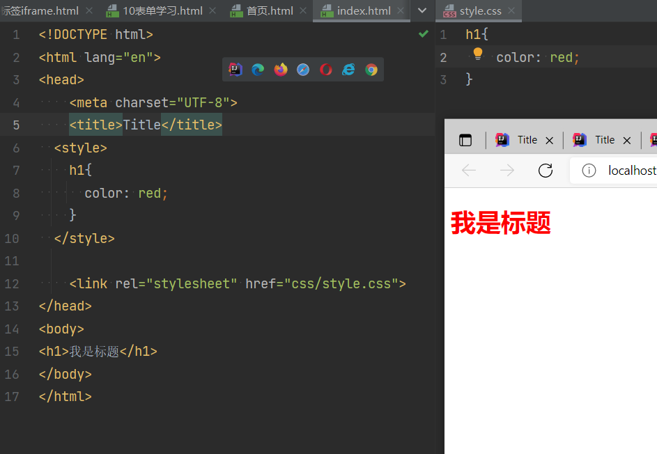
<!--  外部样式-->
  <link rel="stylesheet" href="css/style.css">
<!-- 内部样式-->
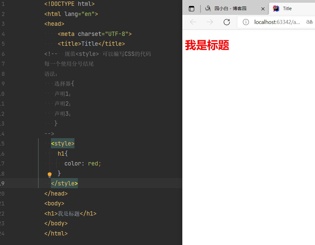
<style>
/* qwep*/
h1{
color: #aaaaff;
}
</style>
</head>
<body>
<!--优先级:就近原则,那个离得近使用谁的样式-->
<!--优先级:行内样式 > 内部样式 > 外部样式-->
<!--行内样式:在标签元素中,编写一个style属性,编写样式即可,不好,多的时候不适用-->
<h1 style="color: red"></h1>
</body>
</html>
-
扩展:外部样式两种写法
-
链接式:
<!-- 外部样式-->
<link rel="stylesheet" href="css/style.css">
-
导入式:
@import 是CSS2.1特有的!
<!--  导入式:-->
  <style>
    @import url("style.css");
  </style>
首页link和import语法结构不同,前者<link>是html标签,只能放入html源代码中使用,后者可看作为css样式,作用是引入css样式功能。import在html使用时候需要<style type="text/css">标签,同时可以直接“@import url(CSS文件路径地址);”放如css文件或css代码里引入其它css文件。
本质上两者使用选择区别不大,但为了软件中编辑布局网页html代码,一般使用link较多,也推荐使用link。
2、选择器
作用:选择页面上的某一元素或某一类元素
2.1 基本选择器
-
标签选择器:选择一类标签
<!DOCTYPE html>
<html lang="en">
<head>
<meta charset="UTF-8">
<title>Title</title>
<style>
/*标签选择器,会选择到页面上所有的这个标签的元素*/
h1{
color: #aaaaff;
background: #008B8B;
border-radius: 24px;
}
p{
font-size: 80px;
}
</style>
</head>
<body>
<h1>学java</h1>
<h1>学java2</h1>
<p>听java</p>
</body>
</html>
-
类选择器:class:选中所有class属性一致的标签,跨标签,类名{}
<!DOCTYPE html>
<html lang="en">
<head>
<meta charset="UTF-8">
<title>Title</title>
<style>
/* 类选择择器的格式:.class的名称{}
好处,可以多各标签归类,是同一个class,可以复用
*/
.zhouwei{
color: hotpink;
}
.weiwei{
color: burlywood;
}
</style>
</head>
<body>
<h1 class="weiwei">标题1</h1>
<h1 class="zhouwei">标题2</h1>
<h1 class="zhouwei">标题3</h1>
<!--实现跨标签-->
<p class="weiwei"> 标题4</p>
</body>
</html>
-
id选择器:全局唯一! # Id名{}
<!DOCTYPE html>
<html lang="en">
<head>
<meta charset="UTF-8">
<title>Title</title>
<style>
/*
id选择器: id必须保证全局唯一!
# id名称{ }
不遵循就近原则,固定的
id选择器 > class选择器(id) > 标签选择器
*/
#zhouwei{
color: #4f4d4e;
}
.vzhv{
color: #aaaaff;
}
h1{
color: aqua;
}
</style>
</head>
<body>
<h1 id="zhouwei">标题1</h1>
<h1 class="vzhv">标题2</h1>
<h1 class="vzhv">标题3</h1>
<h1>标题4</h1>
</body>
</html>
优先选择器:id >class > 标签
2.2、层次选择器
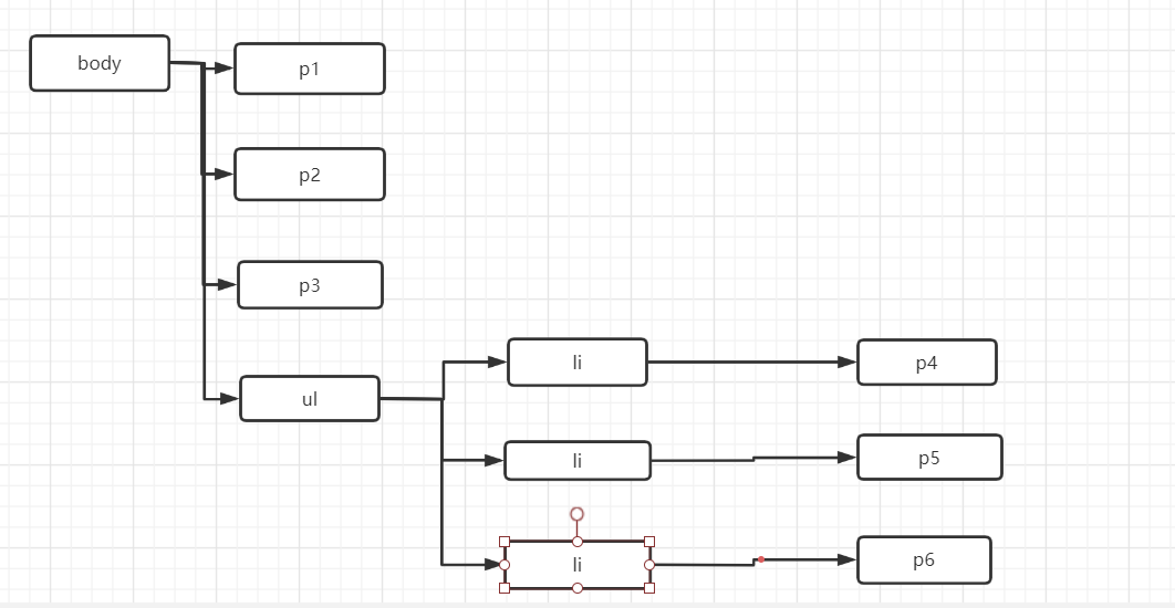
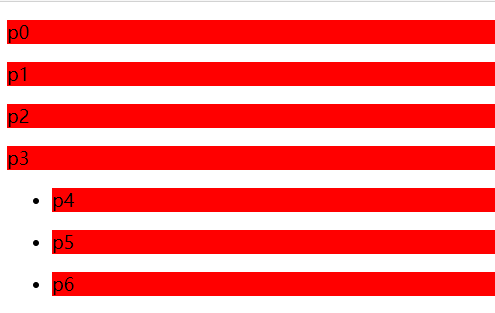
body:
<body>
<p>p0</p>
<p class="active">p1</p>
<p>p2</p>
<p>p3</p>
<ul>
<li><p>p4</p></li>
<li><p>p5</p></li>
<li><p>p6</p></li>
<!--</ul>-->
<!--<p class="active">p7</p>-->
<!--<p>p8</p>-->
</body>
流程图:*
-
后代选择器:在某个元素的后面 ( 祖爷爷 爷爷 爸爸 我)
   body p{
            background: red;
        }
-
子选择器,一代,儿子
子选择器
        body>p{
            background: hotpink ;
        }
-
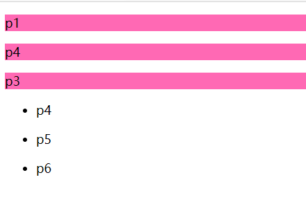
相邻兄弟选择器
/* 兄弟选择器:只有一个,相邻(向下)*/
.active + p{
background: rosybrown;
}
<p class="active">p1</p>
<p>p2</p>
-
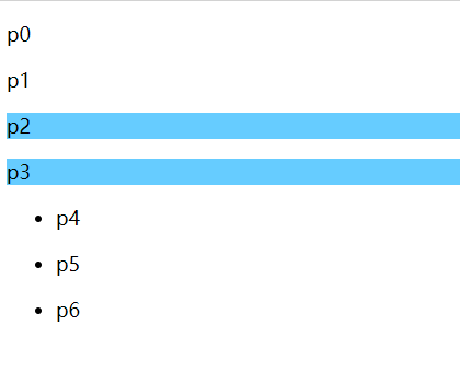
通用选择器
/*    通用选择器,当前选中元素的向下的所有兄弟元素*/
        .active~p{
            background: #66CCFF;
        }
2.3、结构伪类选择器
伪类:条件
<!--不能使用,calss,id选择器-->
<style>
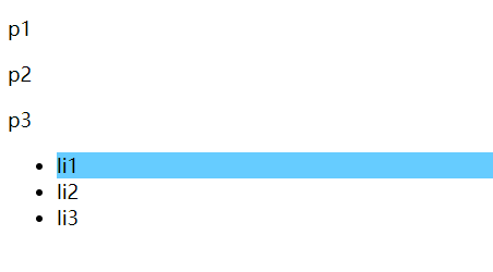
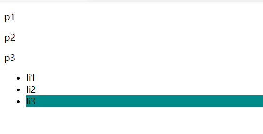
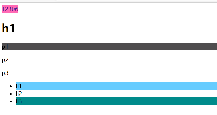
/*!*<!--ul的第一个子元素-->*!*/
ul li:first-child{
background: #66CCFF;
}
/*ul的最后一个子元素*/
/*!*ul的最后一个元素*!*/
ul li:last-child{
background: #008B8B;
}
/* 选中p1 : 定位到父元素,选择当前的第一个元素
选中当前的p元素的父级元素,选中父级元素的第一个,并且是当前元素才生效
*/
p:nth-child(1){
background: #aaaaff;
}
/* 选中父元素,下的p的元素的第二个,类型*/
p:nth-of-type(1){
background: #4f4d4e;
}
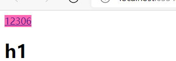
a:hover{
background: hotpink;
}
</style>
</head>
<body>
<a href="">12306</a>
<h1>h1</h1>
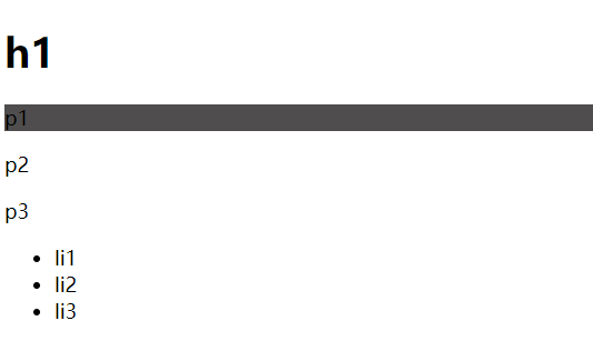
<p>p1</p>
<p>p2</p>
<p>p3</p>
<ul>
<li>li1</li>
<li>li2</li>
<li>li3</li>
</ul>
</body>
2.4、属性选择器 (重要)
id + class 相结合
<!DOCTYPE html>
<html lang="en">
<head>
<meta charset="UTF-8">
<title>Title</title>
<style>
.demo a{
float: left;
display: block;
height: 50px;
width: 50px;
border-radius: 10px;
background: #aaaaff;
text-align: center;
color: #4f4d4e;
text-decoration: none;
margin-right: 5px;
font:bold 20px/50px Arial\;
}
/* 属性名, 属性名 = 属性值(正则)
= 是绝对等于
*= 是包含这个元素
^= 以这个开头
$= 以这个结尾
*/
/* 存在id属性的元素 a[属性的东西]{} */
/* a[id]{*/
/* background: yellow;*/
/* }*/
/*!*id=firstr的变量*!*/
/*a[id=firsr]{*/
/* background: #63ff23;*/
/*}*/
/*!* class 中有links 的元素*!*/
/* a[class*="links"]{*/
/* background: yellow;*/
/* }*/
/*!* 选中href中Yuihttp开头的元素*!*/
/* a[href^=http]{*/
/* background: #cccccc;*/
/* }*/
a[href$=pdf]{
background:#e0c90d;
}
</style>
</head>
<body>
<p class="demo">
<a href="http://www.baidu.com" class="links item first" id="firsr">1</a>
<a href="http://www.baidu.com" class="links item active" target="_blank" title="test">2</a>
<a href="images/123.html" class="links item">3</a>
<a href="images/123.png" class="links item" >4</a>
<a href="images/123.jpg" class="links item">5</a>
<a href="abc" class="links item">6</a>
<a href="/a.pdf" class="links item">7</a>
<a href="/abc.pdf" class="links item">8</a>
<a href="abc.doc" class="links item">9</a>
<a href="abcd.doc" class="links item">10</a>
</p>
</body>
</html>
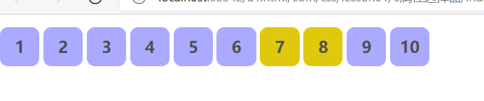
=    绝对等于
*=   是包含这个元素
^=   以这个开头
$=   以这个结尾
3、美化网页元素
3.1、为什么要美化网页
-
有效的传递页面信息
-
美化网页,页面漂亮,才能吸引用户
-
凸显网页的主体
-
提高用户的体验
3.2字体样式
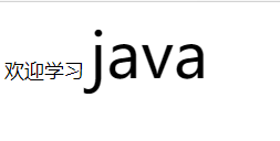
span标签:重点要突出的字,用span标签
<style>
#titel{
font-size: 50px;
}
</style>
</head>
<body>
欢迎学习 <span id="titel">java</span>
</body>
<!--  font-family:字体
font-size:字体大小
font-weight:字体粗细
color:字体颜色
 -->
  <style>
    body{
      font-family: 微软雅黑;
      color: #aaaaff;
    }
    h1 {
      font-size: 30px;
    }
    .p1{
      font-weight: bold;
    }
  </style>
3.3、文本样式
-
颜色 : color rgba
-
文本对齐的方式: test-align = center
-
首行缩进; test- indent:2em
-
行高 line-height
-
下划线(装饰)text-decoration
-
文本图片水平对齐:(上)text-decoration: underline;(中)text-decoration: line-through;(下)text-decoration: overline;
<!DOCTYPE html>
<html lang="en">
<head>
<meta charset="UTF-8">
<title>Title</title>
<!--
颜色:
单词
RGB 0~f
RGBA
text-align:排版 居中
text-indent: 2em;首行缩进两个字符
行高 和 块的高度一致,就可以上下居中
-->
<style>
h1{
color: #66CCFF;
text-align: center;
}
.p1{
text-indent: 2em;
}
.p3{
font-size: 25px;
background: palevioletred;
height: 30px;
line-height:30px;
}
/*上划线*/
.l1{
text-decoration: underline;
}
/*中划线*/
.l2{
text-decoration: line-through;
}
/*下划线*/
.l3{
text-decoration: overline;
}
</style>
</head>
<body>
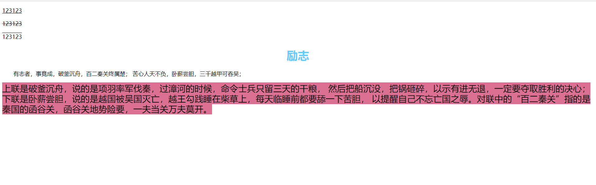
<p class="l1">123123</p>
<p class="l2">123123</p>
<p class="l3">123123</p>
<h1>励志</h1>
<p class="p1">有志者,事竟成,破釜沉舟,百二秦关终属楚;
苦心人天不负,卧薪尝胆,三千越甲可吞吴;
</p>
<p3 class="p3">
上联是破釜沉舟,说的是项羽率军伐秦,过漳河的时候,命令士兵只留三天的干粮,
然后把船沉没,把锅砸碎,以示有进无退,一定要夺取胜利的决心;
下联是卧薪尝胆,说的是越国被吴国灭亡,越王勾践睡在柴草上,每天临睡前都要舔一下苦胆,
以提醒自己不忘亡国之辱。对联中的“百二秦关”指的是秦国的函谷关,函谷关地势险要,一夫当关万夫莫开。
</p3>
</body>
</html>
<!DOCTYPE html>
<html lang="en">
<head>
<meta charset="UTF-8">
<title>Title</title>
<!--
水平对齐 参照物 a,b
-->
<style>
img,span{
vertical-align:middle;
}
/* 去下划线*/
.a{
text-decoration: none;
}
</style>
</head>
<body>
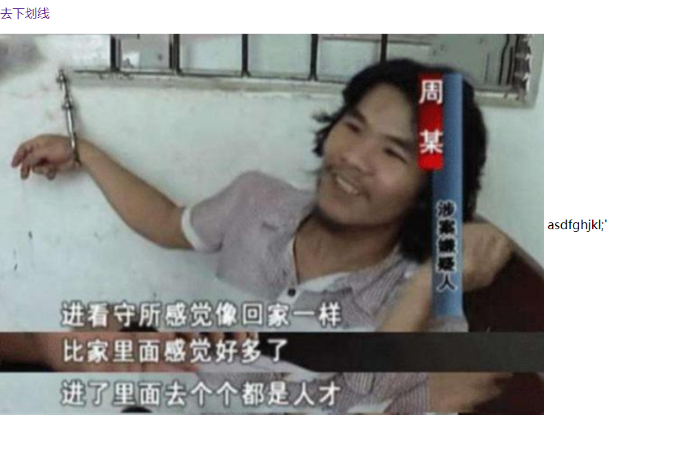
<a href="" class="a">去下划线</a>
<p>
<img src="images/a.png" alt="">
<span>asdfghjkl;'</span>
</p>
</body>
</html>
3.4、阴影
/*text-shadow:阴影颜色,水平位移,垂直偏移,阴影半径*/
#price{
    text-shadow: #e0c90d 10px 10px 2px;
}
3.5、超链接伪类
正常情况下,a a:hover
<!--        默认的颜色-->
        a{
            text-decoration: none;
            color: black;
        }
    /*鼠标悬浮的颜色*/
a:hover{
    color: orange;
    font-size: 25px;
}
/*鼠标按住未释放的状态*/
a:active{
    color: green;
}
3.6、列表
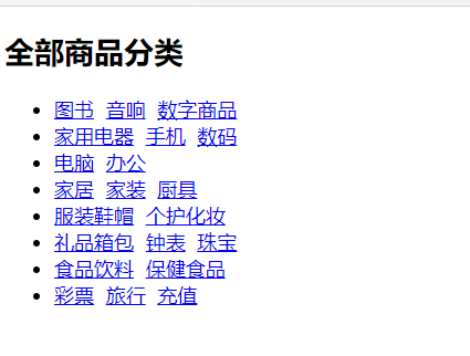
body
<div id="nav">
<h2 class="title">全部商品分类</h2>
<ul>
<li><a href="#">图书</a> <a href="#">音响</a> <a href="#">数字商品</a></li>
<li><a href="#">家用电器</a> <a href="#">手机</a> <a href="#">数码</a></li>
<li><a href="#">电脑</a> <a href="#">办公</a></li>
<li><a href="#">家居</a> <a href="#">家装</a> <a href="#">厨具</a></li>
<li><a href="#">服装鞋帽</a> <a href="#">个护化妆</a></li>
<li><a href="#">礼品箱包</a> <a href="#">钟表</a> <a href="#">珠宝</a></li>
<li><a href="#">食品饮料</a> <a href="#">保健食品</a></li>
<li><a href="#">彩票</a> <a href="#">旅行</a> <a href="#">充值</a></li>
</ul>
</div>
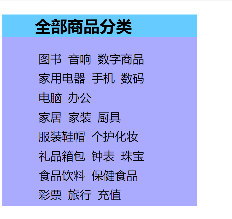
#nav{
width: 300px;
background: #aaaaff;
}
.title{
font-size: 25px;
font-weight: bold;
text-indent: 2em;
line-height: 35px;
background: #66CCFF;
}
/*ul li*/
/*
list-style:
none;去掉圆的
circle:空心圆
decimal:数字
square:正方形
*/
/*ul{*/
/* background: #aaaaff;*/
/*}*/
ul li{
height: 30px;
list-style: none;
text-indent: 1em;
}
a{
text-decoration: none;
font-size: 18px;
color: #080706;
}
a:hover{
color: hotpink;
text-decoration: underline;/*下划线*/
}
3.7、背景
背景颜色
背景图片
<style>
        div{
            width: 500px;
            height: 350px;
            border: 1px solid red;
            background-image: url("images/aaa.png");
            /*默认全部是平铺的*/
        }
        /*水平平铺*/
        .div1{
            background-repeat: repeat-x;
        }
        /*竖直平铺*/
        .div2{
            background-repeat: repeat-y;
        }
        /*不平铺*/
        .div3{
            background-repeat: no-repeat;
        }
    </style>
练习:在3.6的基础上加图片
.title{
background: #66CCFF url("../images/com01.png") no-repeat 260px ;
}
ul li{
height: 30px;
list-style: none;
text-indent: 1em;
background-image: url("../images/com01.png");
background-repeat: no-repeat;
background-position: 220px;
}
3.8、渐变
网址:Grabient
background-color: #00DBDE;
background-image: linear-gradient(297deg, #00DBDE 0%, #FC00FF 100%);
4、盒子模型
4.1、什么是盒子模型
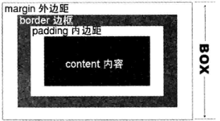
margin:外边距
padding:内边距
border:边框
4.2、边框
-
边框的粗细
-
边框的样式
-
边框的颜色
<style>
/*body总有一个默认的外边框margin:0 常见操作(规范)*/
h1,ul,li,a,body{
margin: 0;
padding: 0;
text-decoration: none;
}
/*border:粗细,样式,颜色*/
#box{
/**/
width: 300px;
border: 1px solid red;
}
h2{
font-size: 25px;
/*margin: 0;*/
background-color: #aaaaff;
color: white;
}
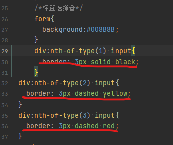
/*标签选择器*/
form{
background:#008B8B;
}
div:nth-of-type(1) input{
border: 3px solid black;
}
div:nth-of-type(2) input{
border: 3px dashed yellow;
}
div:nth-of-type(3) input{
border: 3px dashed red;
}
</style>
</head>
<body>
<div id="box">
<h2>会员登录</h2>
<form action="">
<div>
<span>用户名:</span>
<input type="text">
</div>
<div>
<span>密码:</span>
<input type="text">
</div>
<div>
<span>邮箱:</span>
<input type="text">
</div>
</form>
</div>
</body>

4.3、内、外边距
<!DOCTYPE html>
<html lang="en">
<head>
<meta charset="UTF-8">
<title>Title</title>
<!-- 外边距的妙用:居中元素
margin: 0 auto;居中
-->
<style>
#box{
/**/
width: 300px;
border: 1px solid red;
margin: 0 auto;
}
/*
margin: 0;
margin: 0 1px;
margin: 0 1px 2px 3px;
*/
h2{
font-size: 25px;
/*margin: 0;*/
background-color: #aaaaff;
color: white;
margin-top: 0;
}
/*标签选择器*/
form{
background:#008B8B;
}
input{
border: 1px solid black;
}
/*内边距:padding*/
a:nth-of-type(1){
padding: 10px 20px;
}
</style>
</head>
<body>
<div id="box">
<h2>会员登录</h2>
<form action="">
<div>
<span>用户名:</span>
<input type="text">
</div>
<div>
<span>密码:</span>
<input type="text">
</div>
<div>
<span>邮箱:</span>
<input type="text">
</div>
</form>
</div>
</body>
</html>
盒子的计算方式:你这个元素到底有多大? 美工+前端
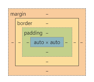
最终元素大小=margin+border+padding+内容宽度
4.4、圆角边框
4个角
<style>
<!-- 左上 右上 右下 左下,顺时针-->
div{
/*半圆*/
/*width: 50px;*/
/*height: 50px;*/
/*margin: 30px;*/
/*background: red;*/
/*border-radius: 50px 0px 0px 0px;*/
/* 半圆*/
width: 100px;
height: 50px;
margin: 30px;
background: red;
border-radius: 50px 50px 0px 0px;
}</style>
</head>
<body>
<div>
</div>
</body>
(现成框架)
源码之家
后台管理系统 模板之家(现成框架)
layui
vue-element-admin
element
飞冰
4.5、盒子阴影
<!DOCTYPE html>
<html lang="en">
<head>
<meta charset="UTF-8">
<title>Title</title>
<style>
/*margin: 0 auto;居中
要求:块元素有固定的宽度
*/
img{
margin: 0 auto;
/*width: 100px;*/
/*height: 100px;*/
/*border: 10px solid red;*/
border-radius: 50px;/*圆角*/
box-shadow: 10px 10px 100px yellow;
}
</style>
</head>
<body>
<div style="width: 500px;display: block;text-align: center">
<img src="../../lesson02/6背景/images/aaa.png" alt="">
</div>
</body>
</html>
5、浮动
5.1、标准文档流
块级元素:独占一行
h1~h6 p div 列表...
行内元素:不不独占一行
span a img strong...
行内元素可以包含在块级元素中,反之则不可以
5.2、dispaly
<!DOCTYPE html>
<html lang="en">
<head>
    <meta charset="UTF-8">
    <title>Title</title>
<!--
display: block;  块元素
display: inline;行内元素
display: inline-block;是块元素,但是可以内联,在一行
none:
-->
  <style>
    div{
      width: 100px;
      height: 100px;
      border: 1px solid red;
      display: inline;
    }
    span{
      width: 100px;
      height: 100px;
      border: 1px solid red;
      /*display: block;*/
      display: none;
    }
  </style>
</head>
<body>
<div>div块元素</div>
<span>span行内元素</span>
</body>
</html>
-
这个也是一种实现行内元素排列的方式,但是我们很多的情况都使用float
5.3、Float
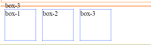
左右浮动:float:left/right
<!DOCTYPE html>
<html>
<head>
<meta charset="UTF-8">
<title></title>
<style type="text/css">
body{
font-size: 22px;
}
.wrap{
width: 400;
border: 2px #F60 dotted;
margin: 10px auto;
}
.box{
width: 100px;
height: 100px;
border: 2px #36F dotted;
margin: 10px;
}
.fl{
float: left;
}
.fr{
float: right;
}
</style>
</head>
<body>
<div class="wrap">
<div class="box">box-1</div>
<div class="box">box-2</div>
<div class="box">box-3</div>
</div>
<div class="wrap">
<div class="box fr">box-1</div>
<div class="box">box-2</div>
<div class="box">box-3</div>
</div>
<div class="wrap">
<div class="box fr">box-1</div>
<div class="box fl">box-2</div>
<div class="box">box-3</div>
</div>
<div class="wrap">
<div class="box fl">box-1</div>
<div class="box fl">box-2</div>
<div class="box fl">box-3</div>
</div>
</body>
</html>
5.4 、父级边框塌陷的问题
 /*
      clear: left;清除左侧浮动
      clear: right;清除右侧浮动
      clear: both;两侧都不能有浮动
      clear: none;所有
      */
      clear: left;
      clear: right;
      clear: both;
      clear: none;
解决方案:
-
增加父级元素的高度(不建议使用)
#father{
    border:1pz #000 solid;
    height:800px;
} -
增加一个空的div,清除浮动
<div  class="clear">   </div>
.clear{
     clear:both;
     /**/
     margin:0;
     padding:0;
}
-
overfloat
在父级元素中增加一个    Overflow:hidden;
在父级元素中增加一个    Overflow:auto;
<!DOCTYPE html>
<html lang="en">
<head>
<meta charset="UTF-8">
<title>Title</title>
<style>
#cotent{
width: 200px;
height: 150px;
overflow: scroll;
}
</style>
</head>
<body>
<div id="cotent">
<img src="images/aaa.png" alt="">
<p>有志者,事竟成,破釜沉舟,百二秦关终属楚;
苦心人天不负,卧薪尝胆,三千越甲可吞吴;</p>
</div>
</body>
</html>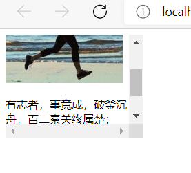
-
父类添加一个伪类:after
<style>
#father:after{
/*加空内容*/
content: '';
/*将空文本变成一个块*/
display: block;
float: left;
}
</style>
<body>
<div id="father">内容</div>
</body>
小结:
-
浮动元素后面增加空DIV
简单,代码中尽量避免空DIV
-
设置父元素的高度
简单,元素假设有了固定的高度,就会被限制
-
overflow
简单,下拉的一些场景避免使用
-
父类添加一个伪类:after(推荐使用)
写法稍微复杂一点,但是没有副作用
5.5、对比
-
display
方向不可以控制
-
float
浮动起来的话会脱离标准文案流,所以要解决父级边框塌陷的问题~
6、定位
6.1、相对定位
<!DOCTYPE html>
<html lang="en">
<head>
<meta charset="UTF-8">
<title>Title</title>
<!--
相对定位
相对于自己原来的位置进行偏移
-->
<style>
div{
margin: 10px;
padding: 5px;
font-size: 12px;
line-height: 25px;
}
#father{
border: 4px solid #aaaaff;
padding: 0px;
}
#first{
border: 4px dashed #66CCFF;
background-color: lightblue;
position: relative;/*相对定位:上下左右*/
top: -20px;
left: 20px;
}
#scond{
border: 4px dashed #30BD8C;
background-color: lightblue;
}
#third{
border: 4px dashed #FC00FF;
background-color: lightblue;
position: relative;
bottom: -10px;
right: 20px;
}
</style>
</head>
<body>
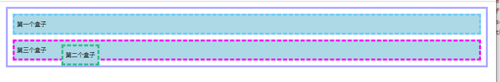
<div id="father">
<div id="first">第一个盒子</div>
<div id="scond">第二个盒子</div>
<div id="third">第三个盒子</div>
</div>
</body>
</html>
原来的盒子
相对位置的盒子
相对定位:position:relative;
相对于原来的位置,进行指定的偏移,相对定位的话,它任然在标准文档流中!原来的位置会被保留
-
练习

<!DOCTYPE html>
<html lang="en">
<head>
<meta charset="UTF-8">
<title>Title</title>
<style>
#box{
width: 300px;
height: 300px;
padding: 10px;
border: 2px solid rebeccapurple;
}
a{
width: 100px;
height: 100px;
text-decoration: none;
background: #FC00FF;
/*行高与高度一致可实现居中*/
line-height: 100px;
text-align: center;
color: white;
/*变成块*/
display: block;
}
/*鼠标放上变色*/
a:hover{
background: #333333;
}
.a2,.a4{
position: relative;
left: 200px;
top: -100px;
}
.a5{
position: relative;
left: 100px;
top: -300px;
}
</style>
</head>
<body>
<div id="box">
<a class="a1" href="#">链接1</a>
<a class="a2" href="#">链接2</a>
<a class="a3" href="#">链接3</a>
<a class="a4" href="#">链接4</a>
<a class="a5" href="#">链接5</a>
</div>
</body>
</html>
6.2、绝对定位
定位:基于XX定位,上下左右~
-
没有父级元素定位的前提下,相对于浏览器定位
-
假设父级元素存在定位,我们通常会相对于父级元素偏移~
-
在父级元素范围内移动
-
相对于父级或浏览器的位置,进行指定的偏移,相对定位的话,它不在在标准文档流中!原来的位置不会被保留
<!DOCTYPE html>
<html lang="en">
<head>
<meta charset="UTF-8">
<title>Title</title>
<style>
div{
margin: 10px;
padding: 5px;
font-size: 12px;
line-height: 25px;
}
#father{
border: 4px solid #aaaaff;
padding: 0px;
/*想要产生绝对定位,又不想产生浏览器,增加相对定位*/
position: relative;
}
#first{
border: 4px dashed #66CCFF;
background-color: lightblue;
}
#scond{
border: 4px dashed #30BD8C;
background-color: lightblue;
/*绝对定位*/
position: absolute;
left: 100px;
}
#third{
border: 4px dashed #FC00FF;
background-color: lightblue;
}
</style>
</head>
<body>
<div id="father">
<div id="first">第一个盒子</div>
<div id="scond">第二个盒子</div>
<div id="third">第三个盒子</div>
</div>
</body>
</html>
默认效果
后来效果
6.3、固定定位 fixed
<!DOCTYPE html>
<html lang="en">
<head>
<meta charset="UTF-8">
<title>Title</title>
<style>
body{
height: 1000px;
}
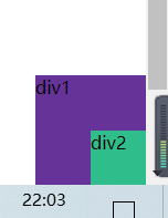
/*父级下的第一个元素*/
div:nth-of-type(1){
width: 100px;
height: 100px;
background: rebeccapurple;
/*a绝对定位:相对于浏览器*/
position: absolute;
right: 0;
bottom: 0;
}
div:nth-of-type(2){
width: 50px;
height: 50px;
background: #30BD8C;
/* position: fixed;:固定定位*/
position: fixed;
right: 0;
bottom: 0;
}
</style>
</head>
<body>
<div>div1</div>
<div>div2</div>
</body>
</html>
定位在浏览器,不管怎么滑动位置都不变
6.4、Z-index
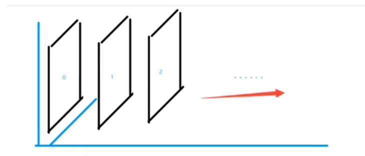
图层~
z-index:默认是0,最高无限~(999)
<!DOCTYPE html>
<html lang="en">
<head>
    <meta charset="UTF-8">
    <title>Title</title>
  <link rel="stylesheet" href="css/style.css" type="text/css">
</head>
<body>
<div id="content">
  <ul>
    <li><img src="images/屏幕截图%202021-07-24%20221226.png" alt=""></li>
    <li class="tipText">学习微服务找狂神</li>
    <li class="tipBg"></li>
    <li>时间2021-7-24</li>
    <li>地点:月球一号基地</li>
  </ul>
</div>
</body>
</html>
#content{
width: 840px;
padding: 0;
margin: 0;
/**/
overflow:hidden ;
font-size: 12px;
line-height: 25px;
border: 1px solid #080706;
}
ul,li{
padding: 0;
margin: 0;
/* 去圆的*/
list-style: none;
}
/*父级元素相对定位*/
#content ul{
/*相对定位*/
position: relative;
}
.tipText,.tipBg{
/*绝对定位*/
position: absolute;
width: 840px;
height: 25px;
top:484px ;
}
.tipText{
color: white;
/*层级*/
z-index: 999;
}
.tipBg{
background: hotpink;
/* 背景透明*/
opacity: 0.5;
/*0~100*/
filter: alpha(opacity=50);
}
7、动画(了解,视野拓展)
-
卡巴斯基实验室
-
html 浪漫告白 源码之家
-
canvas动画
-
标签:color,重点,元素,height,学习,nbsp,background,border,css 来源: https://www.cnblogs.com/laimaihai/p/15058107.html
本站声明: 1. iCode9 技术分享网(下文简称本站)提供的所有内容,仅供技术学习、探讨和分享; 2. 关于本站的所有留言、评论、转载及引用,纯属内容发起人的个人观点,与本站观点和立场无关; 3. 关于本站的所有言论和文字,纯属内容发起人的个人观点,与本站观点和立场无关; 4. 本站文章均是网友提供,不完全保证技术分享内容的完整性、准确性、时效性、风险性和版权归属;如您发现该文章侵犯了您的权益,可联系我们第一时间进行删除; 5. 本站为非盈利性的个人网站,所有内容不会用来进行牟利,也不会利用任何形式的广告来间接获益,纯粹是为了广大技术爱好者提供技术内容和技术思想的分享性交流网站。